About the Client
Recovery Café Skagit is a therapeutic community that provides a safe and supportive space to help individuals with past trauma, mental and emotional anguish, and addictive behaviors. Their person-centered system of care focuses on meeting people where they are on the recovery continuum and engaging them for a lifetime of managing their disease. Recovery Café Skagit's approach is based on the Recovery Orientated System of Care (ROSC), which aims to break the cycle of intense suffering and failure that many people with addiction face. By providing a meaningful sense of membership and belonging in the community, Recovery Café Skagit helps its members gain access to essential services, education, and employment opportunities, supporting human potential and well-being.
Design Journey
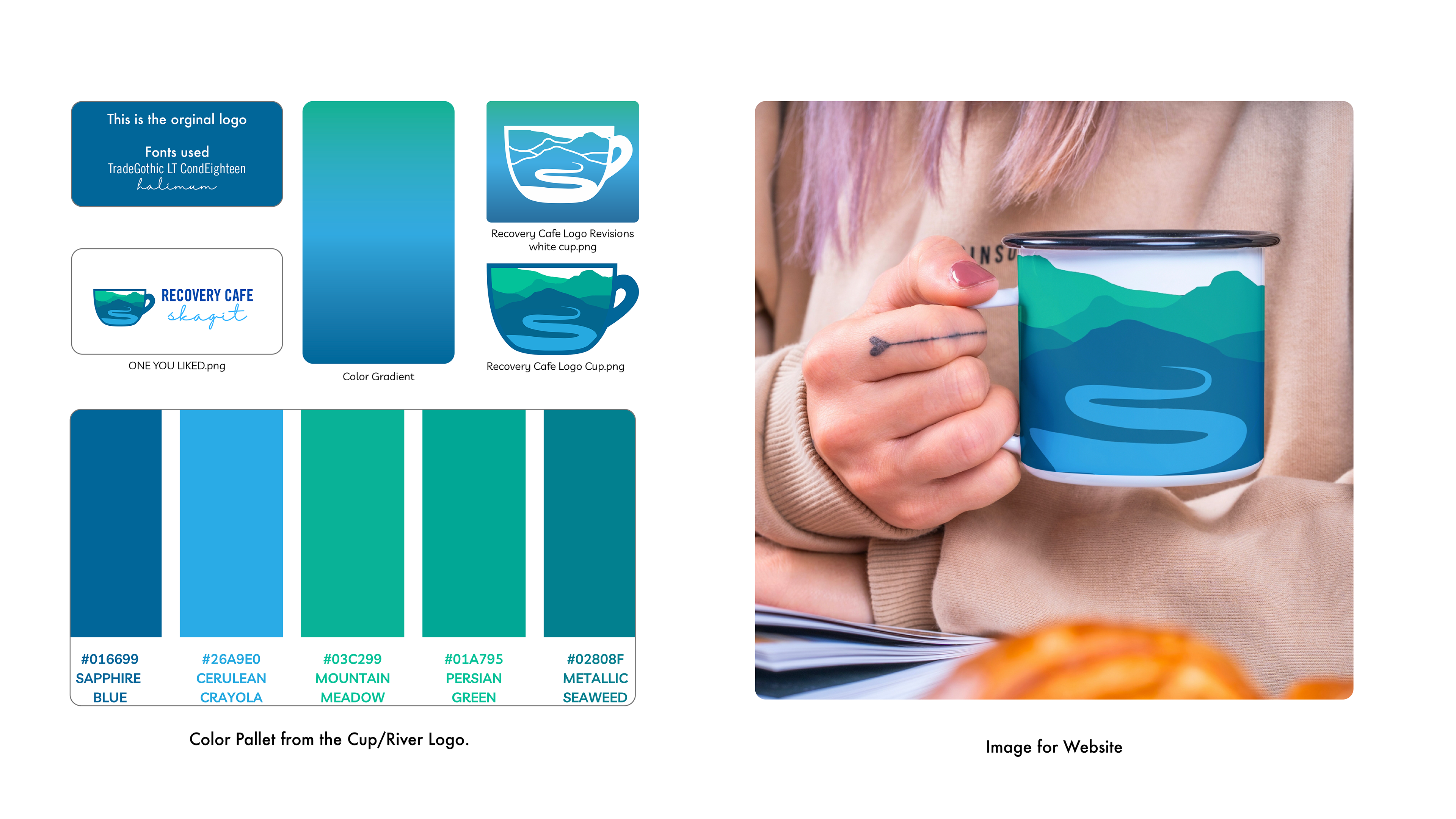
Recovery Cafe Skagit approached me for a logo and website for their business opening soon. They didn't have a clear direction, so I began by presenting them with 12 different designs from other recovery cafes in the area. The team liked the idea of incorporating warm and cool colors, and they were particularly drawn to the Skagit river and the concept of a recovery circle. After several rounds of design revisions, we decided to incorporate the Skagit river into the logo on a coffee cup, as it was a meaningful element that reflected the business's location. The final color palette was chosen based on its association with refreshment, peace, and nature. Green represents emotional harmony, stability, and endurance, while blue is associated with freedom, intuition, and wisdom. The fonts "Bree Serif" for Recovery Cafe and "Majesty" for Skagit were selected to reflect the team's personality and the values of the business. Overall, the logo design represents the concept of healing and recovery, and the color palette and fonts were chosen to create an emotional response that resonates with the brand.

Snapshot of in-process logo design.


