
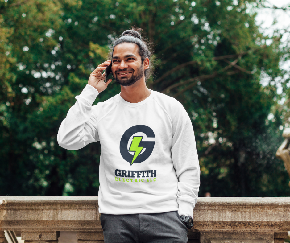
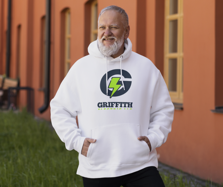
I am thrilled to present my work on the logo and website for Griffith Electric LLC, where I had the opportunity to bring their vision to life.
Drawing inspiration from the iconic Gatorade logo and the vibrant colors of the Seattle Seahawks, I aimed to create a visually striking and memorable identity for the brand. The resulting logo showcases a perfect balance between dynamism and professionalism. The use of bold typography, reminiscent of the Gatorade logo, conveys a sense of energy and power, while the incorporation of the Seahawks' colors adds a touch of local pride and resonance.

Building upon this foundation, I extended the branding elements to their website design, employing a harmonious combination of vibrant hues, sleek layouts, and intuitive navigation. The result is a visually captivating online presence that not only reflects the identity of Griffith Electric LLC but also engages users and encourages them to explore the company's services. To experience the electrifying combination of the Gatorade-inspired logo and the Seahawks' colors, visit [griffithelectricllc.com] and witness the seamless integration of dynamic design and local spirit.